Conversion Design
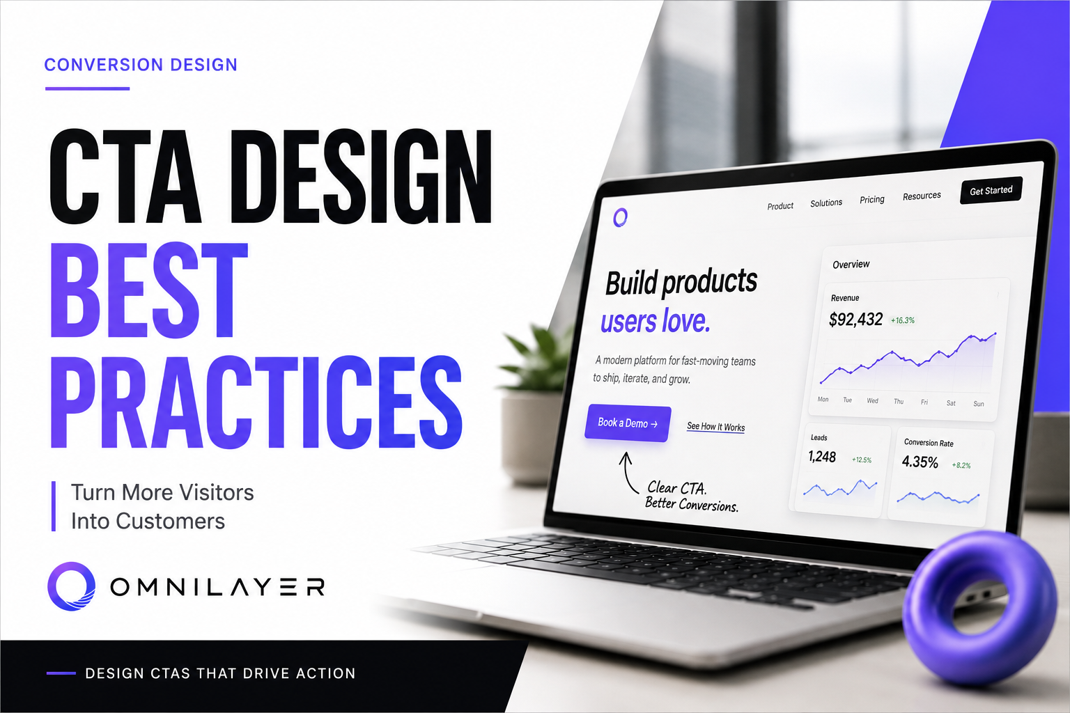
CTA Design Best Practices (2026 Guide): Turn More Visitors Into Customers
A great Call-to-Action isn't just a button—it's the bridge between interest and action. Learn the CTA design principles that help SaaS and B2B websites convert more visitors into customers.
OmniLayer · Aug 12, 2026 · 7 min read
Your website doesn't have a traffic problem.
It often has a decision problem.
A visitor lands on your homepage, reads your headline, scrolls through your features, and likes what they see.
Then...
They leave.
Not because they weren't interested.
Because they didn't know what to do next.
That's exactly what a well-designed Call-to-Action (CTA) solves.
A CTA isn't just a colorful button.
It's the bridge between interest and action.
Whether your goal is booking demos, generating leads, or increasing sales, your CTA can dramatically impact conversions.
Let's look at the principles behind CTAs that actually work.
What Is a CTA?
A Call-to-Action (CTA) is any element that encourages users to take the next step.
Examples include:
- Book a Demo
- Start Free Trial
- Get a Free Audit
- Download the Guide
- Contact Sales
- Join Waitlist
Every page should answer one simple question:
What should the visitor do next?
If your page doesn't answer that clearly, users create their own answer—which is usually leaving.
10 CTA Design Best Practices
1. Make One Primary CTA Impossible to Miss
One of the biggest mistakes companies make is presenting too many choices.
Buttons like:
- Learn More
- Pricing
- Features
- Blog
- Careers
- Login
- Contact
all compete for attention.
Instead, choose one primary conversion goal.
Examples:
- Book a Demo
- Start Free Trial
- Schedule Consultation
Everything else should support—not compete with—that action.
A confused visitor rarely converts.
2. Use Action-Oriented Copy
Your CTA should describe exactly what happens after clicking.
Weak examples:
- Submit
- Continue
- Click Here
Better examples:
- Book Your Free Demo
- Get My Website Audit
- Start Building Today
- Download the Checklist
Strong CTAs reduce uncertainty and create momentum.
3. Focus on Value, Not the Action
People don't want to submit.
They want the result.
Instead of:
Submit
Use:
- Get My Quote
- See Pricing
- Start Saving Time
- Improve My Website
The button should communicate the benefit.
4. Create Visual Contrast
Even great copy fails if nobody notices the button.
Your CTA should visually stand out from the rest of the interface.
Best practices include:
- High-contrast colors
- Plenty of whitespace
- Large clickable area
- Consistent button styling
- Clear hover states
If users have to search for your CTA, you've already lost their attention.
5. Place CTAs Throughout the Page
Many websites include only one CTA at the very bottom.
The problem?
Most visitors never reach the bottom.
Include CTAs:
- Above the fold
- After explaining the problem
- After highlighting key benefits
- After testimonials
- Near pricing
- At the end of the page
Every major section should naturally guide visitors toward the next action.
6. Reduce Friction
Every additional step reduces conversions.
Ask yourself:
Do you really need:
- 12 form fields?
- Account creation?
- Phone verification?
- Multiple confirmation pages?
Instead:
- Keep forms short
- Ask only for essential information
- Allow easy scheduling
- Minimize unnecessary clicks
The easier the process feels, the more users complete it.
7. Add Trust Near Your CTA
People naturally hesitate before taking action.
Help them feel confident.
Place trust builders nearby:
- Client logos
- Testimonials
- Ratings
- Case studies
- Security badges
- Money-back guarantees
- "No credit card required"
Trust reduces perceived risk.
8. Use Urgency Carefully
Urgency can improve conversions.
Fake urgency destroys credibility.
Avoid:
- Fake countdown timers
- "Only 2 spots left" when it isn't true
- Constant "Limited Time" banners
Instead, use genuine urgency:
- Applications close Friday
- Early-bird pricing ends this week
- Limited onboarding capacity
Authenticity always wins in the long run.
9. Optimize for Mobile
A surprising number of CTAs perform poorly on mobile devices.
Check that your buttons are:
- Easy to tap
- Large enough
- Visible without excessive scrolling
- Fast to load
- Not blocked by popups
A desktop-perfect CTA means little if mobile visitors struggle to use it.
10. Test Everything
There is no universal "best CTA."
Small changes often create surprisingly large improvements.
Test variables such as:
- Button text
- Color
- Placement
- Size
- Icons
- Supporting copy
- Number of CTAs
- Form length
The highest-converting websites continuously experiment instead of relying on assumptions.
Common CTA Mistakes
Avoid these common issues:
- Using multiple competing primary CTAs
- Generic button text like "Submit"
- Poor color contrast
- Hiding CTAs below the fold
- Asking for too much information
- Making buttons difficult to notice
- Ignoring mobile usability
- Forgetting to explain the value
Small usability issues can quietly reduce conversions for months.
CTA Checklist
Before publishing your page, ask yourself:
- Is there one clear primary CTA?
- Does the button explain the benefit?
- Is it visually prominent?
- Can users find it quickly?
- Is there enough trust nearby?
- Is the process simple?
- Does it work well on mobile?
- Have we tested different versions?
If you answered "no" to any of these, there's likely room for improvement.
Final Thoughts
Your CTA is where your marketing either succeeds or stalls.
You can have exceptional design, compelling copy, and valuable products—but if visitors don't know what to do next, those efforts rarely translate into results.
Great CTAs don't pressure users.
They remove hesitation, clarify the next step, and make taking action feel obvious.
That's what turns a website from a digital brochure into a consistent source of leads and customers.
At OmniLayer, we design high-converting websites that combine clear messaging, strategic user experience, and conversion-focused CTAs to help SaaS and B2B companies generate more business from the traffic they already have.
Stay in the loop
Get our best content in your inbox
No spam, just insights on conversion, design, and SaaS growth.