Conversion Design
Why Beautiful Websites Still Fail to Convert
A stunning website can still lose customers if it lacks clarity, trust, and conversion strategy. Here's why beautiful design alone isn't enough—and what actually drives conversions.
OmniLayer · Aug 10, 2026 · 6 min read
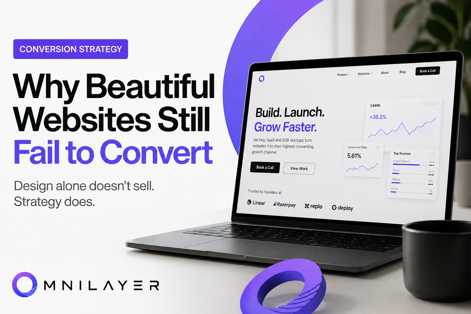
Your website can win design awards and still lose customers.
Scroll through websites featured on design galleries like Awwwards or Dribbble, and you'll find stunning animations, sleek layouts, and pixel-perfect interfaces.
Yet many of those same websites generate surprisingly few leads.
How is that possible?
Because visitors don't buy beautiful websites.
They buy clarity, trust, and confidence.
At OmniLayer, we've seen startups spend months perfecting visuals while overlooking the elements that actually influence buying decisions.
The result?
A website everyone compliments—but nobody converts from.
Beauty Doesn't Equal Conversions
A beautiful interface grabs attention.
A strategic website earns trust.
The highest-converting websites aren't necessarily the most visually impressive.
They're the ones that answer visitors' questions quickly, reduce uncertainty, and make taking action feel easy.
Here's why beautiful websites often fail to convert.
Why Beautiful Websites Fail
1. Beauty Doesn't Answer Questions
When someone lands on your homepage, they're subconsciously asking:
- What do you do?
- Is this for me?
- Why should I trust you?
- What makes you different?
- What should I do next?
Most websites answer none of these within the first few seconds.
Instead, visitors see vague headlines like:
"Building the Future."
Or:
"Innovation Meets Excellence."
They sound impressive.
But they communicate almost nothing.
If people have to figure out what you do, they'll leave before they do.
2. Designers Optimize for Looks. Buyers Optimize for Confidence.
There's a huge difference.
Designers often focus on:
- Modern typography
- Smooth animations
- Fancy interactions
- Creative layouts
Buyers care about very different things:
- Can you solve my problem?
- Have you done this before?
- What results have you delivered?
- How risky is hiring you?
Your website should reduce uncertainty—not increase it.
Every section should make saying "yes" feel easier.
3. Too Much Motion Creates Friction
Animations are great.
Until everything moves.
If every button bounces...
Every image fades...
Every section slides...
Every card rotates...
Visitors spend more time waiting than understanding.
Great user experience feels invisible.
The best websites use motion to guide attention—not to show off.
4. Your Messaging Is Probably Generic
Here's a quick test.
Replace your company name with one of your competitors.
If the website still makes sense...
Your messaging isn't unique.
Words like:
- Innovative
- Cutting-edge
- Scalable
- Next-generation
- World-class
have become meaningless because everyone uses them.
Instead, explain exactly:
- Who you help
- What outcome you create
- Why you're different
Specificity builds trust.
Generic claims build skepticism.
5. You're Talking About Yourself
Many websites sound like an autobiography.
"We started in..."
"Our mission is..."
"We believe..."
"We are passionate..."
Visitors aren't looking for your life story.
They're looking for a solution to their problem.
Shift the focus.
Instead of talking about yourself, show that you understand your customer's challenges.
When people feel understood, they're far more likely to trust you.
6. There's No Proof
Every business says they're the best.
Few prove it.
Trust is built through evidence.
Examples include:
- Client testimonials
- Case studies
- Before-and-after results
- Numbers
- Recognizable clients
- Awards
- Media mentions
Proof removes doubt.
Without it, your claims feel like marketing.
7. Every Page Needs One Clear Goal
Many websites try to do everything.
They try to:
- Sell
- Educate
- Recruit
- Share company history
- Promote features
- Collect newsletter subscribers
The result?
Visitors don't know what action to take.
Every important page should answer one question:
"What's the one thing we want visitors to do next?"
Whether that's booking a demo, requesting a proposal, or scheduling a call, make that action obvious.
8. Speed Matters More Than Fancy Effects
A slow website quietly kills conversions.
Visitors won't wait.
Neither will Google.
Heavy animations, oversized videos, unnecessary scripts, and bloated assets often hurt performance more than they improve aesthetics.
Performance is part of user experience.
Fast websites feel trustworthy.
Slow websites feel unreliable.
9. Great Websites Tell a Story
Think about the visitor's journey.
People arrive with a problem.
Your website should guide them through a simple narrative:
Problem → Solution → Why You → Proof → Action
Most websites skip straight to features.
The best ones build conviction before asking for commitment.
That's what converts.
Design Is Only One Piece of Conversion
Beautiful design absolutely matters.
It creates strong first impressions.
But first impressions don't close deals.
The highest-converting websites combine:
- Clear messaging
- Strategic positioning
- User psychology
- Trust signals
- Fast performance
- Logical information architecture
- Frictionless user experience
- Strong calls-to-action
Design amplifies these elements.
It cannot replace them.
Final Thoughts
If your website gets compliments but not conversations...
If people say it "looks amazing" but rarely contact you...
The issue probably isn't your design.
It's the strategy behind it.
At OmniLayer, we don't just create websites that look premium.
We build websites that communicate clearly, earn trust quickly, and move visitors toward action.
Because in the end, the most beautiful website isn't the one that wins awards.
It's the one that wins customers.
Stay in the loop
Get our best content in your inbox
No spam, just insights on conversion, design, and SaaS growth.