
Conversion Optimization
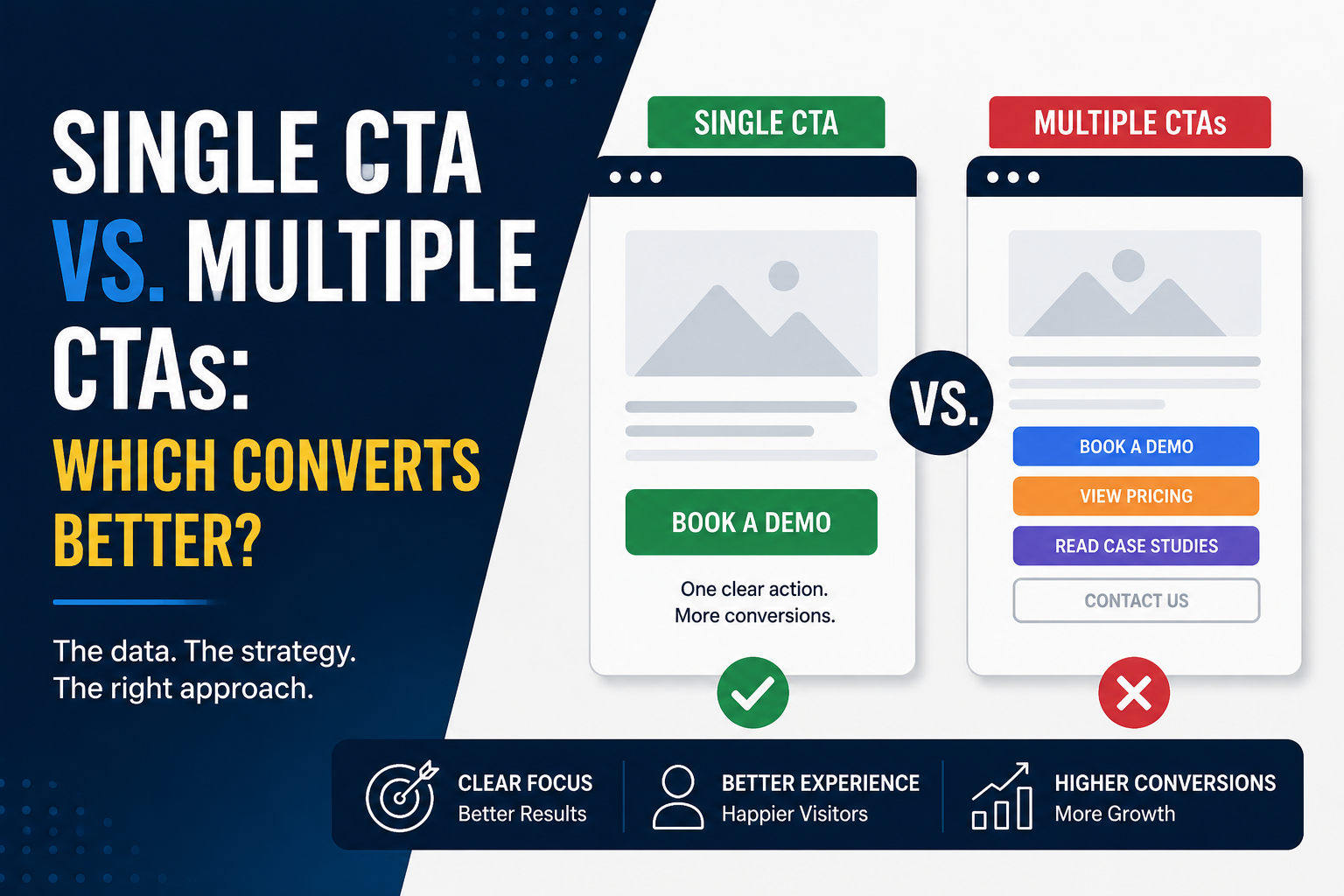
Single CTA vs. Multiple CTAs: Which Converts Better?
Should your website have one clear call-to-action or several? Learn when a single CTA outperforms multiple options—and how to guide visitors toward the action that matters most.
OmniLayer · Jul 26, 2026 · 4 min read
Every website has one goal:
To get visitors to take action.
Whether that's booking a demo, scheduling a call, starting a free trial, or making a purchase, that action is guided by your Call-to-Action (CTA).
But here's a question many businesses overlook:
Should your website focus on one CTA or offer multiple options?
The answer depends on your audience.
But in most cases, less is more.
The Power of a Single CTA
A single CTA gives visitors one clear path to follow.
Imagine landing on a website where every prominent button says:
Book a Free Consultation
There are no competing actions.
No distractions.
Just one obvious next step.
This works because it reduces decision fatigue.
Visitors don't have to think about what to do next—the website guides them naturally.
A single CTA is especially effective for:
- Service-based businesses
- Agency websites
- Landing pages
- Product launches
- Paid advertising campaigns
When your objective is focused, your website should be too.
When Multiple CTAs Make Sense
That doesn't mean multiple CTAs are always a bad idea.
Different visitors are at different stages of the buying journey.
Someone discovering your brand for the first time may not be ready to book a call.
But they might be willing to read a case study or explore your services.
In those situations, offering one primary CTA alongside a few secondary CTAs creates a better user experience.
For example:
- Primary CTA: Book a Demo
- Secondary CTA: View Pricing
- Secondary CTA: Read Case Studies
The key is making it immediately obvious which action you want visitors to take first.
Secondary CTAs should support the primary goal—not compete with it.
The Problem With Too Many Choices
Many websites overwhelm visitors by presenting too many options at once.
For example:
- Contact Us
- Learn More
- View Portfolio
- Read Blog
- Watch Video
- Download Guide
- Subscribe
- Start Trial
When everything is important, nothing feels important.
Instead of guiding visitors, the website forces them to decide what to do next.
And that often leads to doing nothing at all.
A confused visitor rarely becomes a customer.
A Simple Rule to Follow
Think of your CTA strategy like giving someone directions.
If someone asks how to reach a destination, you don't give them five different routes at once.
You recommend the best one.
Your website should work the same way.
Choose one primary action you want visitors to take.
Make it the most visible element on the page.
Use secondary CTAs only to support visitors who need a little more information before they're ready to commit.
Clear guidance creates confident decisions.
Final Thoughts
The best websites don't overwhelm visitors with choices.
They guide them with clarity.
For most businesses, one strong primary CTA paired with a few thoughtfully placed secondary actions creates the ideal balance.
It keeps the experience simple while still supporting visitors at different stages of the buying journey.
Remember, the goal isn't to give people more options.
It's to make the right option impossible to miss.
Stay in the loop
Get our best content in your inbox
No spam, just insights on conversion, design, and SaaS growth.

.png)